Logos can be touchy. When the Gap changed its iconic logo, some customers swore they’d never return.
Now Yahoo says it wants to change its logo, retaining the color purple and the exclamation point.
The change could bode well for the web company, as its current logo is outdated, said Ira Kalb, a professor of Marketing at the Marshall School of Business at USC.
But normally, Kalb suggests companies avoid dramatic ploys.
"The brain likes to relax," he said from his office in Los Angeles. "When you make a change you make the brain uncomfortable. When people feel uncomfortable they don't feel comfortable to buy."
Some companies have made successful logo changes. Here are a few:
Xerox
Xerox has gone through several logo changes as their company evolved. The current red lowercase style was introduced in 2008 but feels new to consumers accustomed to the logo that remained virtually unchanged since 1961.
Adobe
Like in many start-ups, Adobe’s original logo was created by someone close to one of the company’s co-founders.
"The first Adobe logo was created by Marva Warnock, [Adobe co-founder] John Warnock's wife, who was a graphic designer," Adobe spokeswoman Christie Hui said. "The logo was refreshed internally in 1992 to its current version, which features the stylized letter 'A' from the original logo she created."
Nokia
The Finnish communications giant got its start as a paper company near the town of Nokia not far from the Nokianvirta River, which inspired its 1871 logo, a scary-looking fish. The fish remained as logo through the 1960s.
Motorola
Motorola went through branding face lifts as its business transitioned from radios to TVs to computer chips. The classy script of 1947 was replaced in 1955 with the distinctive "M" in the center of the colored circle (usually black, blue or red).
When Google bought the flailing Illinois tech company in 2011, it altered the logo to include many colors as the outline of the circle and the words "a Google company" lest anyone forget.
Kalb said there have been both positive and negative reactions for the added verbiage.
"The bad is Google has this Android platform and they've sold it to other companies. Those companies are scared that [now] they won't get the same high-quality technology from Google as Motorola might get," Kalb said. Those other companies may fear that Motorola might get special, more integrated versions of Google's technology, he added.
However, "Google has a good image, so it lifts up the Motorola brand and it will probably work for the consumers," Kalb said.
Google
Google routinely plays around with its easily recognizable logo via the Google Doodle, something Kalb would usually dissuade. But because it is clear that the actual logo is not being affected, he says it works.

Google team leader Ryan Germick agrees.
"We love celebrating major milestones and special people -- especially the quirky and unexpected. Often, the people or moments we showcase are exactly what inspired Google to build the technology we do (such as the inventor of the zipper, Star Trek, Ada Lovelace, etc.). And we love seeing that 'Oh cool!' moment when people are inspired and delighted by them, just like we were," Germick said.

AT&T
The American Telephone & Telegraph introduced its bell logo in 1889, four years after the company formed. Angus S. Hibbard, the company’s general superintendent, conceived the design.
The 1900 logo was the first to be used throughout the AT&T-owned Bell System and was meant to convey “the growing interconnection between local and long-distance service.”
It’s different from today’s iconic globe logo, created when SBC Communications and AT&T merged in late 2005.
Microsoft
Microsoft’s first logo, used from 1975 to 1979, looks nothing like the one we see today.

“The multi-lined logo, with ‘Micro’ on the first line and ‘Soft’ on the second, reflected how co-founders Bill Gates and Paul Allen came up with the original company name, ‘Micro-Soft’ which represented both microcomputers and software,” a Microsoft spokeswoman said.
In 1980, the software giant changed their logo, which arguably looked like a hair metal band’s record cover. In 1987, the company found something that they stuck with for 25 years.
Last summer, the company unveiled the new, more colorful logo that they continue to use today.
Canon
In 1933, when Precision Optical Instruments Laboratory was established, the name given to cameras manufactured at the time was Kwanon.

According to the company, “This reflected the benevolence of Kwanon, the Buddhist Goddess of Mercy, and embodied the company's vision of creating the best cameras in the world.”
In 1935, the company changed its name to Canon, a word that has meanings ranging from "holy scripture" to "criterion or standard of judgment."
Canon’s most recent logo was created in 1956.

Cisco
Cisco, the networking powerhouse, was founded in San Francisco in 1984. Legend has it that as the founders were driving north to Sacramento to file some documents they were inspired by the beautiful Golden Gate Bridge, which explains the simple, wordless logo that represented the company through 1990.
Apple
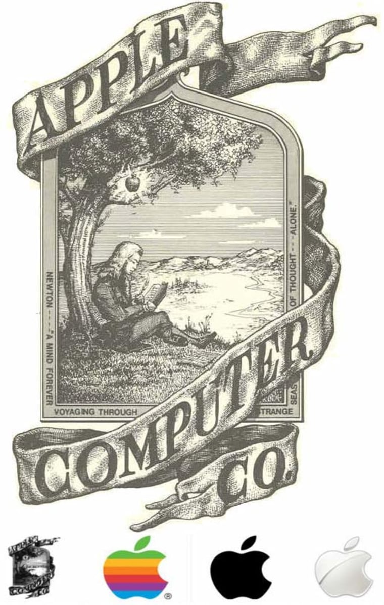
The company that experienced perhaps the most radical change from original logo to current one is Apple. The company’s first logo was designed by one of the original three co-founders, Ronald Wayne. Wayne isn’t the household name that Steve Wozniak and Steve Jobs are because he quickly traded in his 10-percent share of the company two weeks after it was founded for a measly $800.

But during his short time at the company he designed one extremely detailed logo: Sir Isaac Newton sitting under a tree that is about to drop an apple on him. If he had kept his share he would be a billionaire.
Apple didn’t keep Wayne’s logo for even a full year. Jobs ordered a more simple logo and got the now iconic rainbow colored apple with a bite out of it.
Jean-Louis Gassée, the former head of Macintosh development, famously said that "one of the deep mysteries to me is our logo, the symbol of lust and knowledge, bitten into, all crossed with the colors of the rainbow in the wrong order. You couldn't dream of a more appropriate logo: lust, knowledge, hope, and anarchy."
In 1998 the company shed its colors and went to a solid black or a white apple.
IBM
IBM went through several name changes, starting out in 1988 as the Bundy Manufacturing Company. In 1924, the tech company adopted its current name, International Business Machines Corporation.

According to their website “the ornate, rococo letters that formed the ‘CTR’ logo were replaced by the words ‘Business Machines’ in more contemporary sans-sarif type, and in a form intended to suggest a globe, girdled by the word ‘International.’"
In 1972, the industry titan settled on the iconic logo we have seen on computer hardware ever since.
Facebook
In 2006, when the social network was still called “the facebook,” there was a man’s face on its homepage.

Who was he? J. Geils Band fans knew it was lead singer Peter Wolf’s face being covered by zeroes and ones.
The current logo, the lowercase “f,” was designed by New York-based design company Cuban Council.
On their website, CC explains how it went down: “Back when nobody gave a toss about thefacebook.com, we were visited by one Mr. Zuckerberg at our SF offices. Quizzically, he asked us ‘Tell me ... guys, what is ‘design?’” In response, we pulled out this awesome kick-ass logo from our backpacks, flicked it casually across the table and said ... ‘Mark. Dude. Does this answer your question?’"
More business news:
- Overdevelopment widens Florida sinkhole problem
- Dow spirals down on poor earnings and Fed worries
- 3-D printing booms, triggers rush for patents
- Taco Bell's newest shell: One giant, spicy Dorito
- 'Made in France' campaign is tres cher for France
Follow NBCNews.com business onTwitter and Facebook