A brand identity, name, and logo is a company's public face. So you'd think companies would be really careful in figuring out how to revamp that image.
Sadly, a good number of recent rebranding attempts seemed to just crash and burn.
We spoke with award-winning branding agency Method, Inc. and branding guru Rob Frankel about the worst rebranding disasters they've seen in the past few years.
The lesson? A successful rebranding involves overhauling a company's goals, message, and culture — not just changing a name or a logo.
Also, messing with a classic is, more often than not, a bad idea.
Unfortunately, despite their massive marketing budgets, it seems like many major corporations (and one major international city) haven't gotten the memo.
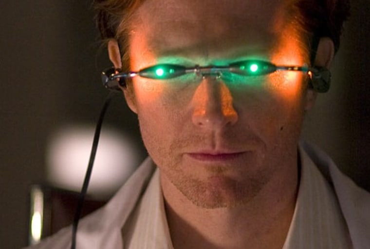
The company's main justification for the change was that, while they couldn't trademark the term "sci fi," they could own the alternate spelling.
In an interview for TVWeek, president David Howe explains another reason: "[T]he thing that we got back from our 18-to-34 techno-savvy crowd, which is quite a lot of our audience, is actually this is how you’d text it... It made us feel much cooler, much more cutting-edge, much more hip."
Not surprisingly, "the response was completely negative," Frankel tells us. "[The change] alienated many longtime fans, and it was completely ridiculed."
And being associated with an STD is never a good marketing tactic.
Tropicana underestimates their customers' attachment to a classic
Silly PepsiCo! All it was trying to do was bring its classic Tropicana OJ into the 21st century.
Unfortunately, the company underestimated how attached their customers had become to the old design. When it rolled out its new cartons in January 2009, the consumer backlash was immediate and powerful.
The New York Times reports that "[s]ome of those commenting described the new packaging as “ugly” or “stupid,” and resembling “a generic bargain brand” or a “store brand.""
After a month of being bombarded by e-mails, phone calls, and social media commentary, PepsiCo announced that it would promptly return to the old carton.
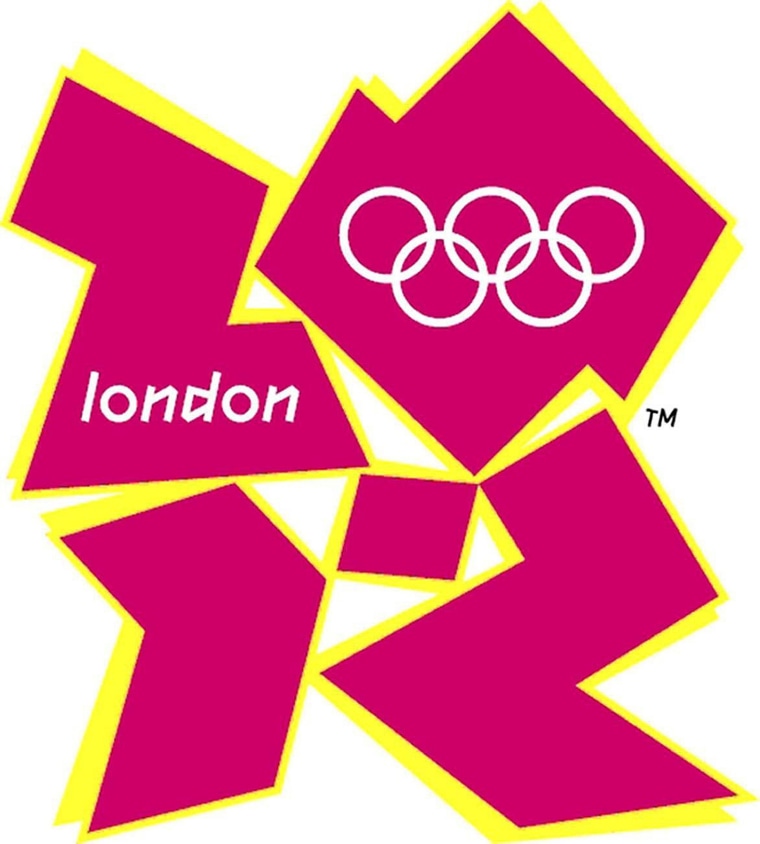
But the organizers behind London's 2012 logo wanted to inject a little modernity into the branding of their Games. As their website puts it, "Our emblem is simple, distinct, bold and buzzing with energy.... It feels young in spirit... Not afraid to shake things up, to challenge the accepted. To change things."
Unfortunately, the unveiling was met with resounding disapproval, and even hostility.
ABC News reports that the logo, which cost $800,000 to create, was generally deemed as childish, ridiculous, ugly, and in no way representative of London or the Games. Visually, "it's really hard to understand what they're trying to say," Method's Alicia Bergin commented.
In an unofficial public poll by the BBC, 80 percent of those surveyed gave the logo the lowest possible ranking.
"Why would anyone throw away decades of brand value (which actually shows up on the balance sheet as an intangible asset) just to try to be cool for a few minutes?" Frankel asks.
Engadget's Joshua Topolsky puts it aptly when he supposes that "they wanted us to immediately picture a remote location where very, very bad things happen."
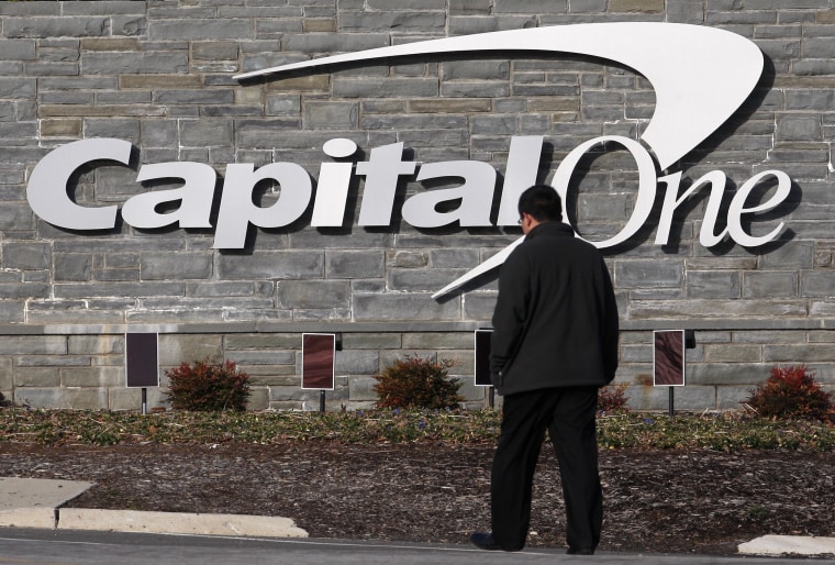
Brand design blog Brand New reacted like this: "Nothing, in the year 2008, can justify the use of a swoosh."
"It doesn't add any distinction, and it's been done a million times before," Bergin tells us. "They wanted to have more of a consumer-facing feel, but this is too obvious."

The result sounds like the quintessential, meaningless, "big corporation" name, Frankel says. Although it was supposedly inspired by the phrase "accent on the future," it tells the customer nothing.
As another one of Time's worst name changes, the article says, "The change cost Andersen/Accenture an estimated $100 million to execute and was regarded as one of the worst rebrandings in corporate history."

According to an ABC News report, the company explained that it chose 'Xe' because the word has "no connotations." It's completely meaningless... and confusing.
Unfortunately, a simple name change won't erase the public memory -- the company is still generally referred to as Blackwater, or some variation of "Blackwater, now renamed Xe", and it's struggling to get business.
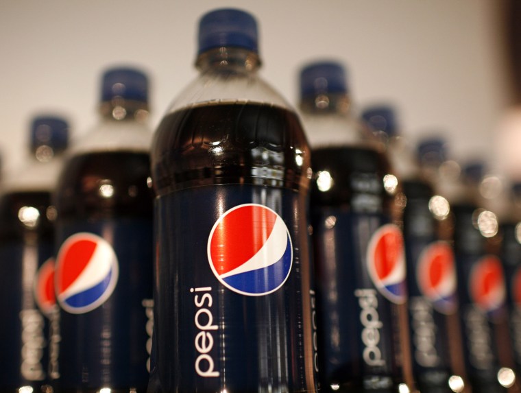
Frankel describes the attempt as a "[r]eal waste of time and money, especially if you've seen the design spec document... An amazing, purposeless document that has no brand value at all," yet cost Pepsi so much.
The white stripe on the new logo varies across Pepsi products, getting wider or thinner depending on product. The design team that spearheaded the campaign explains that they're supposed to be "smiles," but we don't really see it.
As this clever graphic from The Consumerist shows, the Pepsi logo seems to have been redone nearly once a decade over the last century -- while Coke's iconic logo has barely been touched. It's not hard to see which is the better strategy here.
Comcast introduces.... "Xfinity"
Named as one of Time magazine's Top 10 Worst Corporate Name Changes, Comcast's decision to re-name itself "Xfinity" in 11 of its U.S. markets was just awful.
As we reported, "Xfinity? Seriously? What the heck does that mean?"
"Comcast hopes the new moniker will help customers forget the high prices and poor customer service for which the company has been criticized in the past," the Times article says. "Will the name change work? Probably not, but at least it'll sound a bit edgier when you're put on hold ... with Xfinity."
And then there's Aol. (yes, with the period) — and the jury is still out
According to our sources, the reaction to the new Aol. has been split relatively evenly. But the key will be whether or not the company can fulfill the new identity they've adopted through their services and products.
"They've signaled they're re-inventing themselves.... It's ambitious," Bergin says. "The real challenge is can they make all of their products live up to the promise of this new brand."
The Brand New blog points out, "If AOL is committed to shedding not just its Time Warner shares but also its public perception as a web dinosaur then this identity can do it for them."
That is the key to a successful rebranding, after all — "the real reason to rebrand is to alter the expectations you're setting for the public," Frankel explains. "Changing your brand strategy means becoming different company.... it's not just changing your name or your logo."