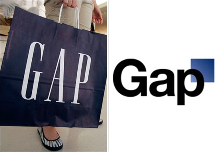
Bowing to pressure from customers who expressed their outrage online, Gap Inc. said Monday it will scrap a widely panned new logo and return to its traditional white-on-blue lettering.
"We heard the message loud and clear," said Louis Callagy, a spokeswoman for the retailer.
Gap last week unveiled a new black-on-white logo with a new typeface and offset blue box, prompting customers to wonder why the iconic retailer had made the sudden decision to scrap its logo, which was more than 20 years old.
The Internet buzz over the controversy, which played out largely on Twitter and the company's Facebook fan page, forced Gap to defend its decision, first on Facebook and then in an article on the Huffington Post by its president, Marka Hansen.
"Our brand and our clothes are changing and rethinking our logo is part of aligning with that," she said in the posting. At the same time she said the company had decided to "engage in the dialogue" and was inviting feedback from customers in an effort to improve the logo through "crowd sourcing."
On Monday the company said it would discontinue use of the new logo in all print and online advertising as well as other corporate messaging.
"We have no plans to use it going forward," she said.
The news was first reported in Advertising Age.
The new design was meant to show how the Gap chain has evolved from its long-standing, even preppy image. It was meant to complement Gap's sleeker new designs, new fits for black pants and khakis and more modern feel, company officials said.
But instead the logo flap served as a lesson in the power of the Internet to influence a company's brand message.
"I think we learned a lot from this," Callagy said. "It's clear we did not go about this the right way."
In the future, she said, the company will make more of an effort to "engage with the online community."
