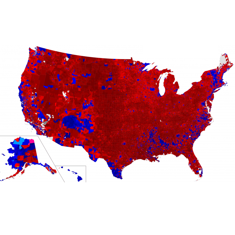
An election expert at Decision Desk HQ spent a year developing what the group says is the most detailed map available of the 2016 election: A national precinct-level map that is so granular that a graphic at this scale was never produced for the 2012 election, according to Decision Desk HQ contributor Ryne Rohla in a post presenting his work.
The hard work paid off in the map, which appears below and shows how President Donald Trump won the upper Midwest and carved out votes into the South up to the "Black Belt."
An interactive version can also be used to zoom-in and see how your neighborhood voted. The map is at the bottom of the page.
As NBCNews.com politics reporter Alex Seitz-Wald wrote earlier this year in Left in the Lurch, Democrats "got more votes across the country, but in the wrong places." He continued: "America’s electoral system rewards the party whose voters are more spread out across the map and, for now, that means the GOP."
Rohla also made maps to compare against for previous years. As the map below of 2012 shows, Barack Obama did significantly better in states like Wisconsin, Michigan and Ohio, where it was a virtual sea of red for Democratic candidate Hillary Clinton in 2016.
Finally, see the below map for 2008, which shows even stronger results for the Democrats.
