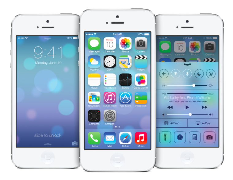
Shortly after wrapping up its annual Worldwide Developers Conference keynote on Monday, Apple made an early version of iOS 7 available to developers. This version of the mobile operating system isn't final — nor is it flawless. Videos posted by some early users show off a few of the joys and annoyances which'll come this fall.
"It's already clear that existing iOS users will be in for a big shock," one user declares. From the initial setup menu, everything is dramatically different. Gone is the lacquered look. Gone is all that fake leather, wood grain and yellow notebook paper found in iOS 6. Gone is the shading and the sheen used to make icons pop.
Everything — app icons, menu options, switches, buttons, toggles, and so on — seems to float on the screen now. That'll take some adjustment, particularly if you're a longtime iOS user.
Your home and lock screens will react to motion in iOS 7. Tilt your phone from side to side and you'll see a parallax effect. If you opt to use one of the "live" wallpapers, this'll means that there's constantly some subtle motion on key screens. In theory, and in the demo videos, this seems fine and dandy ... but could it perhaps get annoying over time? (And how does it affect battery life? We've known for live wallpapers to quickly drain the batteries of devices running other mobile operating systems.)
Swiping up from the bottom of the lock screen can present you with either the Camera app or with the Control Center, depending on which part of the screen you swipe on. Now and then, this is bound to lead to frustration, particularly since swiping up from the center of the screen while the device is unlocked will put you into the device's global search.
But somehow the Control Center makes up for this mess of swipes.
For the first time since the original iPhone was released, iOS users don't have to dig through the Settings app when they want to tweak their phone's brightness or turn off Wi-Fi. The Control Center puts all the most important settings front and center, with a quick swipe up ... no matter where you are within iOS.
Switching between apps no longer involves a weird drawer-like interface at the bottom of the screen. Instead, cards appear in the center of the screen and show a preview of the open apps. The downside is that the music controls no longer live together with the app switching interface (though they are easily reached in the Control Center).
Overall, the first peeks at iOS 7 — the first peeks which didn't come straight from Apple's marketing team, that is — make the mobile operating system look mostly "as advertised." It's dramatically different from anything we've seen in iOS before and it shifts things. Whether it crosses into the realm of "too different" remains to be seen. Only first-hand use will reveal whether all the changes make iOS 7 awkward in the hands of those who loved the earlier iOS, as it was before Apple's design king Jony Ive brought it up to date.
Want more tech news or interesting links? You'll get plenty of both if you keep up with Rosa Golijan, the writer of this post, by following her on Twitter, subscribing to her Facebook posts, or circling her on Google+.
