You may have heard about the problem of Android fragmentation. In a nutshell, the trouble is that there are so many different devices out there, running so many different versions of Google's mobile OS, with so many different processors and button layouts and all the rest, that it's hard to design software for them or reliably make your app or website look right. There are arguments on both sides, but it helps to be able to visualize just how real the fragmentation is.
OpenSignalMaps is a service that maintains maps of mobile carriers' signal strengths, tracked and contributed to by an app you can download. They also keeps records of the brands and models of phones that download the app, and they've just released some interesting figures that show off the huge variety of Android devices out there.
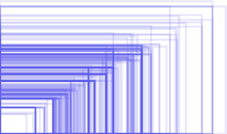
There are a number of visualizations, but this particular pair is perhaps the best representation of what many perceive as a serious problem. Here is a comparison of all the screen resolutions they detected in their data delvings:

And here, for comparison, are all the sizes you have to worry about when considering Apple devices:

Of course, what the Android system loses to complexity, it gains in diversity. There is a device for practically every combination of size, price and power. It's a nightmare for developers in some ways, but also a wonderland for demanding consumers, and a key to its high levels of penetration worldwide.
Check out the rest of the report here, with a few more interesting facts and visualizations of the number and variety of Android devices.
Devin Coldewey is a contributing writer for msnbc.com. His personal website is coldewey.cc.