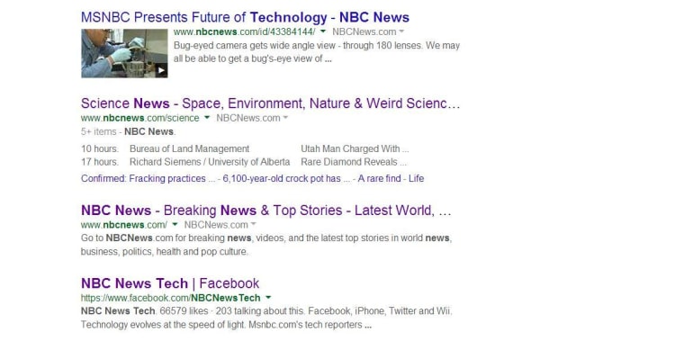
It's not your imagination. Google Search looks different.
On Wednesday, the company announced changes to its desktop search results. It’s not a dramatic overhaul, but if you were surfing the World Wide Web on its 25th birthday, you probably noticed less clutter and more white space.

“We've increased the size of result titles, removed the underlines, and evened out all the line heights,” Jon Wiley, lead designer for Google Search, wrote on Google Plus. “This improves readability and creates an overall cleaner look.”
R.I.P. underlined links, it was good knowing you, even if you did look a little bit dated.
Much like Facebook did with its most recent desktop make-over, Google is trying to create a more consistent look between its desktop and mobile versions. That is especially true for ads, now marked by yellow labels instead of a shaded background, just like they are on your smartphone.
This comes a month after the desktop version of Google Maps was changed, also with an emphasis on cleaner design.