A vast trove of Facebook data makes for interesting analysis, revealing both obvious and subtle things about the way we interact on the world's biggest social network. Mathematician Stephen Wolfram explores and visualizes this data in a fascinating blog post.
Wolfram, creator of the popular "computational knowledge engine" Wolfram Alpha, takes readers on a tour of a large set of friend and demographic data. How old do your friends tend to be as you age? How many friends do people from different countries tend to have? Do men and women use relationship status differently?
These questions and more are examined and illustrated with dozens of colorful graphs and commentary. Even if you're not into statistics, it's a fun read.
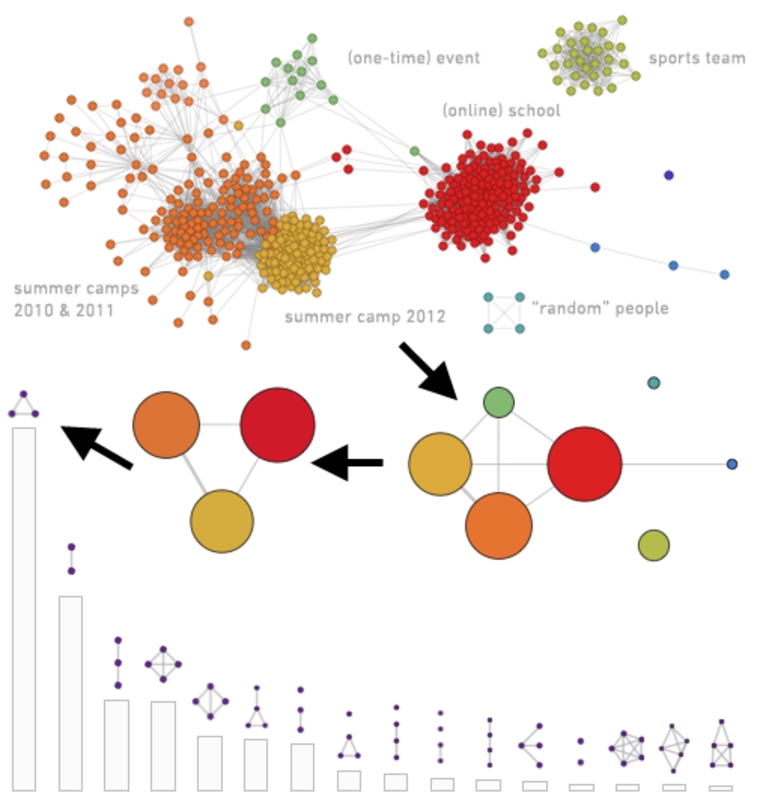
Perhaps the most interesting part is where he examines the different types of friend networks. Sure, everyone's network is different, but if you break it down to its basic parts, it tends to fit into one of several general shapes:

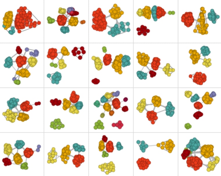
But those shapes could correspond to anything — old friends, new friends, and work friends, for instance. Or perhaps military buddies, members of a hobbyist group, and family. And as the image at the top of the post shows, there are many variations of the slightly less generalized shape.
You can inspect your own friend data by signing up for Wolfram Alpha's Facebook analytics app, or just enjoy the results of others' having shared theirs.
Devin Coldewey is a contributing writer for NBC News Digital. His personal website is coldewey.cc.
