Launched in 2005 for just $5,000 as a city guide for sharing local finds, Refinery29 has become one of the web's hottest fashion and lifestyle websites, with more than 5 million unique monthly visitors and revenue via advertising and e-commerce expected to hit $26 million this year.
While growth has been lightning-fast, founders Philippe von Borries and Justin Stefano realized that their branding wasn't keeping pace. "Media companies are no longer just content publishers in the traditional sense--they manufacture products, create technology platforms, videos and other assets that go far beyond the written word," Stefano says. "We wanted to grow in all those different directions, but our old logo, website and branding just didn't allow for that."
Publishing 80 stories daily, the once-well-crafted blog had become cluttered, inconsistent and difficult to navigate. The founders were also unhappy with how their logo appeared in mobile form--important, as more than 40 percent of Refinery29's traffic is from phones and tablets.
Working with global brand consultancy Wolff Olins, which has aided the reinvention of brands like USA Today, AOL and Target, the teams dove into a four-month "branding boot camp" to address Refinery29's greatest concern: how to stay cool and relevant while it scales and seeks new audiences. "It's the ultimate question and a challenge for most every brand out there," says Marissa Vosper, lead strategist at Wolff Olins, "but especially for Refinery, as their whole business was founded on an indie culture of going against the grain of mass-appeal books like Vogue and Elle."
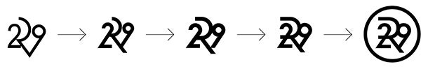
Wolff Olins led the visual manifestation of the brand into the distinct logo "R29," which works on everything from web banners to apparel and merges a high-fashion aesthetic with the boldness of a news site. Then the Refinery29 design team jumped in to tackle the website, designing it with modular elements. "The homepage has five unique sections that can all be swapped out and switched around," Stefano says, "so we can recommend content based on our readers' preferences and easily integrate the next big social platform."
Once cramped and text-heavy, the site is now streamlined and playful, with large photos, more white space, better ad placement, an icon scrollbar and a way to track trends on social sites. To keep readers engaged, slideshows flow from one right into the next--eliminating the "Where do I go now?" decision--and articles are followed by an endless feed of related content.
Refinery29 would not provide numbers but reports a marked increase in article and page views since the July relaunch. And more innovations are in the works. "The risks that media companies run is that they're hot for a few minutes, have a couple good years, and then folks move on to the next thing," Stefano says. "We're focused on creating something that will remain meaningful for at least the next decade."